
csDrawGraph Version 3.1 - Online Manual
Introduction
These instructions are also available in pdf format. We recommend using the PDF version if a printable manual is required.
This is a COM object that dynamically generates 2D bar charts, pie charts, simple line graphs and scatter diagrams. The resulting graph can be output in gif, png, bmp or jpg format. Both gif and png support a transparent colour to help in fitting the graph to a web page. The image can be exported as a binary data stream, making it ideal for use in an ASP application. The graph can also be saved to disk as a file.
A free, fully functional trial version of csDrawGraph is available. This trial version has a built in expiry date that causes it to stop working after that time. This is the only difference in functionality between the trial and full versions. This means that you can fully test if this component is suitable for your application before considering whether to license the full version.
Using these Instructions
These instructions are divided into a number of sections covering the different types of graph. There are quick links to each section. A full Table of Contents is available on the next page and an index listing all commands in alphabetical order is included at the back for easy reference.
The component has a large number of properties that control the appearance of the graphs. When these properties are not specified in code they will take their default values and these defaults have been selected with the aim of producing a legible graph with the minimum of code.
Version 3.0 is supplied as two different DLL files, one is 32 bit and the other 64 bit. Refer to the next section for more details of registration and component instantiation.
Click on one of the links below to go directly to the section of interest:
Table of Contents
- 1. Registering the Component and Getting Started
- 1.1. Registration and Server Permissions
- 1.2. Object Creation
- 1.3. The Trial Version
- 1.4. Using csDrawGraph with Component Services
- 1.5. System Requirements
- 2. Pie Charts
- 2.1. Pie Chart Methods
- 2.2. Pie Chart Properties
- 2.3. Pie Chart Example
- 3. Bar Charts
- 3.1. Bar Chart Methods
- 3.2. Bar Chart Properties
- 3.3. Bar Chart Example
- 4. Line Graphs
- 4.1. Line Graph Methods
- 4.2. Line Graph Properties
- 4.3. Line Graph Example
- 5. Stacked Bar Charts
- 5.1. Stacked Bar Chart Methods
- 5.2. Stacked Bar Chart Properties
- 5.3. Stacked Bar Chart Example
- 6. Miscellaneous Settings
- 6.1. Properties to Define the Axes of Bar and Line Graphs
- 6.2. Legend Properties
- 6.3. Changing the Size of a Graph
- 6.4. Standard Text and Annotations
- 6.4.1. Labels (Axis Values and Pie Chart Labels)
- 6.4.2. Title Text
- 6.4.3. The Prefix, Suffix and ShowSeparator Properties
- 6.5. Decimal Places
- 6.6. Adding Extra Text and Annotations to a Graph
- 6.6.1. AddText and AddExtraLine
- 6.6.2. Adding Text to Line Graphs
- 6.7. Substituting Axis Labels
- 6.8. Plotting Dates or Times
- 6.9. Displaying Percentages on Bar and Pie Charts
- 6.10. Random Colours
- 6.11. Miscellaneous Display Properties and Functions
- 6.12. Functions for Clearing and Checking Existing Data
- 6.13. The DummyGraph Function
- 7. Plotting Lines on Bar Charts
- 7.1. Bar Chart Example With a Plotted Line
- 8. Image Maps
- 8.1. Image Map Methods
- 8.2. Image Map Properties
- 8.3. Generating an Image Map
- 9. Streaming an Image to the Browser
- 9.1. Base64 Encoding of Images
- 10. Language Specific Issues
- 10.1. Active Server Pages
- 10.1.1. ASP with Javascript
- 10.2. Cold Fusion
- 10.3. Visual Basic
- 10.4. ASP.NET
- 10.4.1. Early Binding
- 11. Revision History
- 12. Sample Graphs
- 13. Other Products from Chestysoft
- 14. Alphabetical List of Commands
1. Registering the Component and Getting Started
1.1. Registration and Server Permissions
Before the component can be used the DLL file must be registered on the server. This can be done using the command line tool REGSVR32.EXE. Take care to use the corect version of this tool as there is a 64 bit version in the Windows\System32 folder and a 32 bit version in the Windows\SysWOW64 folder. The syntax is:
regsvr32 dllname
where dllname is the path and name of the DLL to register.
There are two DLL files supplied in the zip archive, one for 32 bit systems and one for 64 bit. The 32 bit file is called csDrawGraph.dll (csDrawGraphTrial.dll for the trial version). The 64 bit file is called csDrawGraph64.dll (csDrawGraph64Trial.dll for the trial version). The 64 bit file cannot be used on 32 bit systems.
Chestysoft has a free utility that performs this registration function through a Windows interface which can be easier although the result is identical to using regsvr32. This tool can be downloaded from the Chestysoft web site: www.chestysoft.com/dllregsvr/default.asp
We suggest creating a folder specifically for component dlls rather than using the Windows System folder as this makes them easier to manage and avoids the naming confusion on 64 bit systems.
The application that uses the component must have permission to read and execute the DLL. In a web application like ASP this means giving the Internet Guest User account Read and Execute permission on the file. This account must also have the appropriate permissions to write if the component is to save images to disk.
1.2. Object Creation
In any script or programme that uses the component an object instance must be created. The syntax in ASP is as follows.
For the full 32 bit version:
Set Chart = Server.CreateObject("csDrawGraph.Draw"")
For the trial 32 bit version:
Set Chart = Server.CreateObject("csDrawGraphTrial.Draw")
For the full 64 bit version:
Set Chart = Server.CreateObject("csDrawGraph64.Draw"")
For the trial 64 bit version:
Set Chart = Server.CreateObject("csDrawGraph64Trial.Draw")
In each the object name is "Chart", but any variable name could be used.
1.3. The Trial Version
The trial version of the component is supplied as a separate DLL called csDrawGraphTrial.dll (or csDrawGraph64Trial.dll). This trial version is fully functional but it has an expiry date, after which time it will stop working. The object can still be created after the expiry date but it cannot produce graphs.
The expiry date can be found by reading the Version property.
Version - String, read only. This returns the version information and for the trial, the expiry date.
Example:
Set Chart = Server.CreateObject("csDrawGraphTrial.Draw")
Response.Write Chart.Version
Visit the Chestysoft web site for details of how to buy the full version - www.chestysoft.com
1.4. Using csDrawGraph with Component Services
A COM component can be added to a COM+ Application in Component Services. One reason to do this is to be able to run a 32 bit component on a 64 bit system. Another is to specify a Windows account that will run the component and this may allow network access or acces to files that would be unavailable if the component was called by the default internet guest user.
An online description of configuring Component Services is available here: https://www.chestysoft.com/component-services.asp.
1.5. System Requirements
Version 3.0 does not support earlier Windows operating systems. It requires Windows 2003 or later for a server or Windows XP or later for a desktop. It will not register or run on Windows 2000. We can still provide version 2 for any users of an older operating system.
2. Pie Charts
Pie charts are drawn by adding data items using the AddData method. Each data item has a name, a value and a colour and each item will be shown as a separate sector on the pie chart. An optional legend can be generated showing the names and colours of each data item. Properties are available to specify the position of the pie and its diameter, as well as options for showing the data values and/or the labels (data item names). Note that if the pie sectors are small these text annotations may interfere with each other. The data items are shown anticlockwise in the order that they are added, and the starting point is defined by the StartAngle property.
2.1. Pie Chart Methods
AddData Name, Value, Colour - Each data item in a pie chart has a Name - which may be displayed on the chart or in the legend, a Value - which must be a positive numeric value, and a Colour - which is a six character hexadecimal string giving the RGB value of the colour (eg "ff0000" is red). A random colour can be used by using the character "R" instead of the six characters (upper or lower case but a single character only).
A separate call to AddData must be made for each data item in the chart.
Example:
Chart.AddData "Item 1", 17, "ff0000"
Chart.AddData "Item 2", 28, "00ff00"
Chart.AddData "Item 3", 5, "0000ff"
This would add three items of data, to be displayed in red, green and blue respectively. The first data item is shown starting at the bottom of the chart and extending anticlockwise. Each subsequent data item is shown anticlockwise from the previous item.
GIFPie - This command generates the pie chart and it is called after all the calls to AddData have been made and after any other properties have been set. It returns binary data as a variant array, in GIF format, and in ASP this must be included inside a Response.BinaryWrite command to display in a browser.
Example:
Response.ContentType = "image/gif"
Response.BinaryWrite Chart.GIFPie
PNGPie - As above, but the pie chart is in PNG format.
BMPPie - As above, but the pie chart is in bitmap format.
JPGPie - As above, but the pie chart is in JPG format.
Charts can also be saved to disk and the following commands do this, in the same choice of formats. These commands could be used if the programming environment does not support the variant array data type as used by the previous commands.
SaveGIFPie FileName - Generates a pie chart and saves it in GIF format. FileName is the physical path and file name where it is to be saved.
SavePNGPie FileName - Generates a pie chart and saves it in PNG format.
SaveBMPPie FileName - Generates a pie chart and saves it in BMP format.
SaveJPGPie FileName - Generates a pie chart and saves it in JPG format.
In a web application the Internet Guest User account must have write permission in the destination folder for files to be saved without error.
2.2. Pie Chart Properties
The properties described here are specific to pie charts. The default values are in brackets.
CenterX - Integer. X-coordinate of the centre of the pie, measured from the left. (175)
CenterY - Integer. Y-coordinate of the centre of the pie, measured from the top. (150)
PieDia - Integer. Diameter of the pie in pixels. (200)
StartAngle - Real. Position of the first pie segment measured in degrees, anticlockwise, with zero at the bottom of the circle. (0)
Offset - Integer. The spacing between the labels and the pie chart edge. It does not represent any specific units but a larger value gives a larger spacing. (10)
There are other properties listed in other sections of these instructions that can also be used to control the appearance of a pie chart.
2.3. Pie Chart Example
The following example shows how a pie chart can be drawn using ASP.
<%
Response.Expires = 0
Response.Buffer = true
Response.Clear
Set Chart = Server.CreateObject("csDrawGraph.Draw")
Chart.Title = "Pie Chart Example"
Chart.AddData "Item 1", 17, "ff0000"
Chart.AddData "Item 2", 28, "00ff00"
Chart.AddData "Item 3", 5, "0000ff"
Response.ContentType = "image/gif"
Response.BinaryWrite Chart.GIFPie
%>
In this example all the data values are hard coded and the default property values are used. It is written for the full version of the component. Use "csDrawGraphTrial.Draw" as the parameter for Server.CreateObject if the trial version is used.
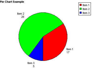
The Title property has been set, with the title using the default settings for font and position.
3. Bar Charts
Bar charts are drawn by adding data items using the AddData method. Each data item has a name, a value and a colour and each item will be shown as a separate bar on the bar chart. An optional legend can be generated showing the names and colours of each data item. A large number of properties are available to control the size, shape and appearance of bar charts. These include options for displaying negative values and for turning the chart round to show the bars horizontally.
An optional linear regression trend line can be shown on bar charts by setting the ShowTrendLine property to true.
3.1. Bar Chart Methods
AddData Name, Value, Colour - Each data item in a bar chart has a Name - which may be displayed on the chart or in the legend, a Value - which must be a numeric value, and a Colour - which is a six character hexadecimal string giving the RGB value of the colour (eg "ff0000" is red). A random colour can be used by using the character "R" instead of the six characters (upper or lower case but a single character only).
A separate call to AddData must be made for each data item in the chart.
Example:
Chart.AddData "Item 1", 17, "ff0000"
Chart.AddData "Item 2", 28, "00ff00"
Chart.AddData "Item 3", 5, "0000ff"
This would add three items of data, to be displayed in red, green and blue respectively.
GIFBar - This command generates the bar chart and it is called after all the calls to AddData have been made and after any other properties have been set. It returns binary data as a variant array, in GIF format, and in ASP this must be included inside a Response.BinaryWrite command to display in a browser.
Example:
Response.ContentType = "image/gif"
Response.BinaryWrite Chart.GIFBar
PNGBar - As above, but the bar chart is in PNG format.
BMPBar - As above, but the bar chart is in bitmap format.
JPGBar - As above, but the bar chart is in JPG format.
Charts can also be saved to disk and the following commands do this, in the same choice of formats. These commands could be used if the programming environment does not support the variant array data type as used by the previous commands.
SaveGIFBar FileName - Generates a bar chart and saves it in GIF format. FileName is the physical path and file name where it is to be saved.
SavePNGBar FileName - Generates a bar chart and saves it in PNG format.
SaveBMPBar FileName - Generates a bar chart and saves it in BMP format.
SaveJPGBar FileName - Generates a bar chart and saves it in JPG format.
In a web application the Internet Guest User account must have write permission in the destination folder for files to be saved without error.
3.2. Bar Chart Properties
BarWidth - Integer. Width of each bar in pixels. Auto calibrate if zero. (0)
BarGap - Integer. Space between bars in pixels. Auto calibrate if zero. (0)
LabelVertical - Boolean. Determines the orientation of the names of each data item written under each bar. (false)
ShowBarTotal - Boolean. When true the data value will be shown above each bar. (false)
BarTotalVertical - Boolean. Controls the orientation of the data values above each bar. (false)
VerticalBars - Boolean. Changing this to false will turn the bar chart round so that the bars are horizontal. The x-axis will run vertically and the y-axis horizontally. Some other properties may need to be changed from their default values to position the chart correctly. (true)
The following properties control the trend line.
ShowTrendLine - Boolean. When true a linear regression trend line will be drawn on the bar chart. (false)
ShowTotalifZero - Boolean. When this is false the data values will not be shown if they are zero. (true)
TrendLineColor - String. The colour of the trend line as a 6 digit hexadecimal string. ("000000")
TrendLineWidth - Integer. The thickness of the trend line, in pixels. (1)
TrendLineName - String. The name that will appear in the legend to describe the trend line. If this is an empty string the trend line will not be displayed in the legend. (null)
There are a large number of properties that can be used with bar charts that are described in other sections of these instructions.
As of version 2.7 of csDrawGraph it is possible to plot lines onto bar charts. This is described in Section 7 of these instructions.
3.3. Bar Chart Example
The following example shows how a bar chart can be drawn using ASP.
<%
Response.Expires = 0
Response.Buffer = true
Response.Clear
Set Chart = Server.CreateObject("csDrawGraph.Draw")
Chart.Title = "Bar Chart Example"
Chart.TitleX = 120
Chart.ShowBarTotal = true
Chart.AddData "Item 1", 17, "ff0000"
Chart.AddData "Item 2", 28, "00ff00"
Chart.AddData "Item 3", 5, "0000ff"
Response.ContentType = "image/gif"
Response.BinaryWrite Chart.GIFBar
%>
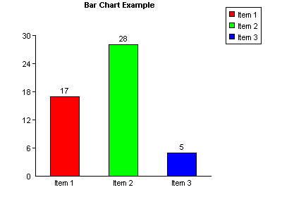
In this example all the data values are hard coded and the default property values are used. It is written for the full version of the component. Use "csDrawGraphTrial.Draw" as the parameter for Server.CreateObject if the trial version is used.
The Title property has been set and TitleX has been used to move the title text into a central position. ShowBarTotal is true which causes the value of each data item to appear above each bar.
Refer to Section 6 for the full range of properties that are shared with other graph types, such as setting the axes, positioning the legend and additional annotation.
4. Line Graphs
The line graphs drawn by csDrawGraph are simple 2-D graphs on a single set of X and Y axes. Multiple lines can be displayed on one graph if the lines are separate colours. By default the points are hidden and the lines joining the points are shown. Changing the PointStyle property will make the points appear and setting ShowLine to false will hide the graph lines and this arrangement can be used to draw a type of scatter diagram.
4.1. Line Graph Methods
AddPoint (X, Y, Colour, Name) - This command adds a point to be plotted on a line graph. X and Y are the coordinates of the point, which must be numeric values. Colour is a six character hexadecimal string giving the RGB colour value of the line. Name is a string and it will be displayed if a legend is used. When the graph is plotted all the points that are the same colour will be joined by straight lines going from point to point in the order they were added.
A separate call to AddPoint must be made for each point on the graph.
Example:
Chart.AddPoint 0, 0, "ff0000", "Red Line"
Chart.AddPoint 30, 30, "ff0000", ""
Chart.AddPoint 0, 0, "00ff00", "Green Line"
Chart.AddPoint 30, 20, "00ff00", ""
This would draw two lines, one in red and the other in green. Note that the name used in the legend is the first value of Name for each colour so an empty string can be used for the remaining entries.
GIFLine - This command generates the line graph and it is called after all the calls to AddPoint have been made and after any other properties have been set. It returns binary data as a variant array, in GIF format, and in ASP this must be included inside a Response.BinaryWrite command to display in a browser.
Example:
Response.ContentType = "image/gif"
Response.BinaryWrite Chart.GIFLine
PNGLine - As above, but the line graph is in PNG format.
BMPLine - As above, but the line graph is in bitmap format.
JPGLine - As above, but the line graph is in JPG format.
Graphs can also be saved to disk and the following commands do this, in the same choice of formats. These commands could be used if the programming environment does not support the variant array data type as used by the previous commands.
SaveGIFLine FileName - Generates a line graph and saves it in GIF format. FileName is the physical path and file name where it is to be saved.
SavePNGLine FileName - Generates a line graph and saves it in PNG format.
SaveBMPLine FileName - Generates a line graph and saves it in BMP format.
SaveJPGLine FileName - Generates a line graph and saves it in JPG format.
In a web application the Internet Guest User account must have write permission in the destination folder for files to be saved without error.
AddMarker (X, Y, PointStyle, PointSize, Colour) - This draws an additional point that is not connected to a line, using the style, size and colour specified. X and Y are coordinates of the point on the graph and are floating point values. PointStyle is an integer defining the shape of the point, as described below. PointSize is an integer defining the point size and Colour is a string defining the colour. This command can be used to define a point type instead of using the global properties described in the next section. It can be used to mark additional points that are not on a line.
4.2. Line Graph Properties
LineWidth - Integer. Width of the graph lines in pixels. (1)
ShowLine - Boolean. Determines whether points are shown joined together. Set to false for a scatter diagram. (true)
PointStyle - Integer. Determines the type of point that will be drawn. 0 - none, 1 - dot, 2 - circle, 3 - diagonal cross, 4 - vertical cross, 5 square, 6 diamond, 7 triangle (point at the top), 8 triangle (point at the bottom). This property applies to all the graph lines. (0)
PointSize - Integer. Size of the plotted point. (2)
XValuesVertical - Boolean. Determines the orientation of the x-axis values. When true, the values are written up the page from bottom to top. (true)
HideHGrid - Boolean. Hides the horizontal grid lines, when ShowGrid is true. (false)
HideVGrid - Boolean. Hides the vertical grid lines, when ShowGrid is true. (false)
PrefixX - String. This value will be shown in front of the numeric values on the x-axis. (null)
PrefixY - String. This value will be shown in front of the numeric values on the y-axis. (null)
SuffixX - String. This value will be shown after the numeric values on the x-axis. (null)
SuffixY - String. This value will be shown after the numeric values on the y-axis. (null)
ShowSeparatorX - Boolean. When true, commas will be used to separate thousands on the x-axis. (false)
ShowSeparatorY - Boolean. When true, commas will be used to separate thousands on the y-axis. (false)
There are a large number of properties that can be used with line graphs that are described in other sections of these instructions.
4.3. Line Graph Example
The following example shows how a line graph can be drawn using ASP.
<%
Response.Expires = 0
Response.Buffer = true
Response.Clear
Set Chart = Server.CreateObject("csDrawGraph.Draw")
Chart.ShowGrid = true
Chart.YAxisText = "Y Axis"
Chart.XAxisText = "X Axis"
Chart.AxisTextBold = true
Chart.AddPoint 0, 0, "ff0000", "Red Line"
Chart.AddPoint 30, 30, "ff0000", ""
Chart.AddPoint 0, 0, "00ff00", "Green Line"
Chart.AddPoint 30, 20, "00ff00", ""
Response.ContentType = "image/gif"
Response.BinaryWrite Chart.GIFLine
%>
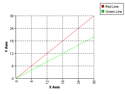
In this example all the data values are hard coded and the default property values are used. It is written for the full version of the component. Use "csDrawGraphTrial.Draw" as the parameter for Server.CreateObject if the trial version is used.
The grid is displayed by setting ShowGrid to true. This uses the default style and colour settings. The axes are labelled by setting the XAxisText and YAxisText properties and the text for these labels has been specified as bold.
5. Stacked Bar Charts
Stacked bar charts are a variation of bar chart that allow the data to be grouped. The bars that make up a group are shown end on or "stacked".
5.1. Stacked Bar Chart Methods
AddGroupedData Group, Name, Value, Colour - Each data item belongs to a Group, which is a string, and all items belonging to a Group will appear as part of the same bar. The Group may be shown under each bar. Each data item has a Name, which is a string, and this may be displayed in the legend. Value must be a positive number. Colour is a six character hexadecimal string giving the RGB value of the colour representing the data item. Data items with the same name should have the same colour although no checks are made to enforce this.
A separate call to AddGroupedData must be made for each data item in the graph.
Example:
Chart.AddGroupedData "January", "Red things", 17, "ff0000"
Chart.AddGroupedData "January", "Blue things", 28, "0000ff"
Chart.AddGroupedData "February", "Red things", 5, "ff0000"
Chart.AddGroupedData "February", "Blue things", 14, "0000ff"
This would add the data to draw two bars, one marked "January", and the other marked "February". Each bar would be split into two areas, one red and the other blue. If the legend is to be displayed it would have a red square marked "Red things" and a blue square marked "Blue things".
GIFStackedBar - This command generates the stacked bar chart and it is called after all the calls to AddGroupedData have been made and after any other properties have been set. It returns binary data as a variant array, in GIF format, and in ASP this must be included inside a Response.BinaryWrite command to display in a browser.
Example:
Response.ContentType = "image/gif"
Response.BinaryWrite Chart.GIFStackedBar
PNGStackedBar - As above, but the stacked bar chart is in PNG format.
BMPStackedBar - As above, but the stacked bar chart is in bitmap format.
JPGStackedBar - As above, but the stacked bar chart is in JPG format.
Charts can also be saved to disk and the following commands do this, in the same choice of formats. These commands could be used if the programming environment does not support the variant array data type as used by the previous commands.
SaveGIFStackedBar FileName - Generates a stacked bar chart and saves it in GIF format. FileName is the physical path and file name where it is to be saved.
SavePNGStackedBar FileName - Generates a stacked bar chart and saves it in PNG format.
SaveBMPStackedBar FileName - Generates a stacked bar chart and saves it in BMP format.
SaveJPGStackedBar FileName - Generates a stacked bar chart and saves it in JPG format.
In a web application the Internet Guest User account must have write permission in the destination folder for files to be saved without error.
5.2. Stacked Bar Chart Properties
The properties used for ordinary bar charts are also used by stacked bar charts, so refer to the section on bar chart properties for a description. The VerticalBars property is also used and when true the bars are vertical and when false the chart is turned around showing the bars going horizontally across the screen.
The properties which are unique to stacked bar charts control how the numeric values are shown for each data item, if they are to be displayed. These properties are described below.
ShowStackedValue - Boolean. When true each data item will have its value displayed next to the bar or inside the bar, depending on the value of StackedTextAlign. The following properties define the font appearance. (false)
StackedTextFont - String. Font face used for the data values. ("Arial")
StackedTextSize - Integer. Size of text used for the data values. (8)
StackedTextBGColor - String. Background colour of the data value text as a 6 digit hexadecimal string. ("ffffff")
StackedTextColor - String. Colour of the data value text as a 6 digit hexadecimal string. ("000000")
StackedTextTransparent - Boolean. When true the data values have a transparent background. (true)
StackedTextAlign - Integer. Determines the position and orientation of the data value relative to the bars. 0 - Centre Horizontal, 1 - Centre Vertical, 2 - Left Horizontal, 3 - Left Vertical, 4 - Right Horizontal, 5 - Right Vertical. (0)
The horizontal values mean the text reads from left to right, the vertical values read from bottom to top and the centre values show the text inside the bar. Note that when VerticalBars is set to false to make the bars horizontal the data values will only be shown horizontally and an alignment of left or right means above or below respectively.
5.3. Stacked Bar Chart Example
The following example shows how a stacked bar chart can be drawn using ASP.
<%
Response.Expires = 0
Response.Buffer = true
Response.Clear
Set Chart = Server.CreateObject("csDrawGraph.Draw")
Chart.ShowBarTotal = true
Chart.ShowStackedValue = true
Chart.StackedTextAlign = 4
Chart.AddGroupedData "January", "Red things", 17, "ff0000"
Chart.AddGroupedData "January", "Blue things", 28, "0000ff"
Chart.AddGroupedData "February", "Red things", 5, "ff0000"
Chart.AddGroupedData "February", "Blue things", 14, "0000ff"
Response.ContentType = "image/gif"
Response.BinaryWrite Chart. GIFStackedBar
%>
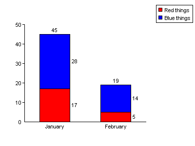
In this example all the data values are hard coded and the default property values are used. It is written for the full version of the component. Use "csDrawGraphTrial.Draw" as the parameter for Server.CreateObject if the trial version is used.
The numbers above and to the side of the bars are not shown by default. The total above the bar is shown because ShowBarTotal has been set to true and the individual values are shown because ShowStackedValue is true. StackedTextAlign specifies where the values are displayed relative to the bars.
6. Miscellaneous Settings
6.1. Properties to Define the Axes of Bar and Line Graphs
The following properties apply to graphs with axes, such as bar charts and line graphs. They set the length of each axis including any negative amount, the position of the graph origin and define the way each axis is calibrated.
Default property values are shown in brackets.
OriginX - Integer. X-coordinate of the origin, measured from the left of the image. (50)
OriginY - Integer. Y-coordinate of the origin, measured from the top of the image. (250)
MaxX - Integer. Length of the x-axis in pixels. (250)
MaxY - Integer. Length of the y-axis in pixels. (200)
XAxisNegative - Integer. Length of the negative x-axis in pixels. The length of the positive x-axis will be (MaxX - XAxisNegative). Only line graphs can have a negative x-axis. (0)
YAxisNegative - Integer. Length of the negative y-axis in pixels. The length of the positive y-axis will be (MaxY - YAxisNegative). (0)
XTop - Real. Maximum value on the x-axis. Auto calibrate if zero. (0)
XGrad - Real. Distance between the graduations on the x-axis as plotted values, not pixels. Auto calibrate if zero. (0)
YTop - Real. Maximum value on the y-axis. Auto calibrate if zero. (0)
YGrad - Real. Distance between the graduations on the y-axis as plotted values, not pixels. Auto calibrate if zero. (0)
XOffset - Real, positive value only. The starting value on the x-axis. Set this when the range of values on the x-axis do not start from zero. (0)
YOffset - Real, positive value only. The starting value on the y-axis. Set this when the range of values on the y-axis do not start from zero. (0)
ShowGrid - Boolean. When true, grid lines will be drawn on the graph level with the graduations on the axes. For bar charts only horizontal grid lines are shown. (false)
GridStyle - Integer. Determines the line type used for the grid lines. 0 - solid, 1 - dot, 2 - dash. (1)
GridColor - String. Colour of the grid lines as a 6 digit hexadecimal string. ("000000")
XMarkSize - Integer. The length of the graduation mark on the x-axis of a line graph. (4)
YMarkSize - Integer. The length of the graduation mark on the y-axis. (4)
PlotAreaColor - String. Background colour of the area enclosed by the axes as a 6 digit hexadecimal string. ("ffffff")
ShowPlotBorder - Boolean. When true, the plot area is enclosed by a rectangular border the colour of GraphPen. (false)
XAxisText - String. Label to display along the x-axis. (null)
YAxisText - String. Label to display along the y-axis. (null)
AxisTextFont - String. Font to use for the axis text. ("Arial")
AxisTextSize - Integer. Size of the axis text. (8)
AxisTextBold - Boolean. When true the axis text is bold. (false)
AxisTextBGColor - String. Colour of the background to the axis text as a 6 digit hexadecimal string. ("ffffff")
AxisTextColor - String. Colour of the axis text. ("000000")
6.2. Legend Properties
The following properties control the appearance and position of the legend. They apply to all types of graph.
LegendX - Integer. X-coordinate of the legend box. (320)
LegendY - Integer. Y-coordinate of the legend box. (20)
LegendAlign - Integer. This specifies the part of the legend box to which LegendX and LegendY measure. 0 - Top Left, 1 - Top Centre, 2 - Top Right, 3 - Middle Left, 4 - Middle, 5 - Middle Right, 6 - Bottom Left, 7 - Bottom Centre, 8 - Bottom Right. (0)
LegendVertical - Boolean. When true the legend is a vertical list, when false it is a horizontal list. (true)
LegendTextSize - Integer. Size of the text used in the legend. (8)
LegendFont - String. Font face used for the legend text. ("Arial")
LegendBGColor - String. Background colour of the legend area as a 6 digit hexadecimal value. ("ffffff")
LegendColor - String. Colour of the text and lines in the legend area as a 6 digit hexadecimal value. ("000000")
Square - Integer. Size of the coloured square in the legend box. (8)
Padding - Integer. Spacing inside the legend box. (5)
ShowLegend - Boolean. Determines whether the legend is displayed. (true)
ShowLegendBox - Boolean. Determines whether the rectangle is displayed around the legend. (true)
LegendInvert - Boolean. The legend entries are usually shown in the order the data is entered. Setting LegendInvert to true reverses the order. Does not apply to line graphs. (false)
LegendHideEmptyNames - Boolean. Set to true to prevent legend entries from displaying when the label is an empty string. This option allows empty bars to be added to bar charts as spacers without affecting the legend. In line graphs it can allow a line to be hidden from the legend if no string is used in the AddPoint command. (false)
It is possible to replace the automatically generated legend entries with customised entries by setting CustomLegend to true and adding pairs of text and colour values with the AddCustomLegend method.
CustomLegend - Boolean. Set to true to use the custom legend entries added by AddCustomLegend instead of the automatically generated entries. (false)
AddCustomLegend Value, Colour - Value is the text label to use in the legend and Colour is the colour for the legend entry as a 6 digit hexadecimal string. This method must be called for each entry to be added to a custom legend. These entries will be used when CustomLegend is true.
ClearCustomLegend - Method to clear any entries previously added using AddCustomLegend.
6.3. Changing the Size of a Graph
The size of the image produced by csDrawGraph is defined by the Width and Height properties.
Width - Integer. Width of the graph image in pixels. Default value 400.
Height - Integer. Height of the graph image in pixels. Default value 300.
There are separate properties to cover the size and position of each feature on the graph and so other properties will need to be changed in addition to the width and height to produce a different size of graph.
For a pie chart the pie diameter and position are determined by PieDia, CenterX and CenterY. For other types of graph the plotted area is located by OriginX and OriginY. The overall length of the axes is defined by MaxX and MaxY. On all types of graph the legend is located by LegendX and LegendY.
6.4. Standard Text and Annotations
This section describes the properties that control the standard text that annotates all the types of graph.
6.4.1. Labels (Axis Values and Pie Chart Labels)
The following font properties apply to the values shown along the axes of bar charts and line graphs, as well as the annotation labelling each pie chart sector.
LabelFont - String. Font face for the labels. ("Arial")
LabelSize - Integer. Size of the label text. (8)
LabelBold - Boolean. When true, the labels are bold. (false)
LabelBGColor - String. Background colour of the label text as a 6 digit hexadecimal string. ("ffffff")
LabelColor - String. Colour of the label text as a 6 digit hexadecimal string. ("000000")
The following properties determine whether the labels are displayed.
ShowNumbers - Boolean. Determines whether numerical values are shown on the axes for bar and line graphs, or next to the sectors on pie charts. (true)
ShowLabel - Boolean. Determines whether the names of each data item are displayed on bar and pie charts. (true)
6.4.2. Title Text
A line of text can be added as a title. By default this is drawn at the top left corner of the image in bold but it can be positioned as required and the font can be specified.
Title - String. Single line of text to be displayed if required. The properties controlling the font and position are described below. (null)
TitleX - Integer. X-coordinate of the title text alignment point. (0)
TitleY - Integer. Y-coordinate of the title text alignment point. (0)
TitleFont - String. Font face to use for the title. ("Arial")
TitleSize - Integer. Size of the text used in the title. (8)
TitleBold - Boolean. Determines whether the title text is bold or normal. (true)
TitleBGColor - String. Background colour of the title text as a 6 digit hexadecimal string. ("ffffff")
TitleColor - String. Colour of the title text as a 6 digit hexadecimal string. ("000000")
TitleTextAlign - Integer. This specifies the alignment point of the title text which is the position within the text string that is located by TitleX and TitleY. 0 - Top Left, 1 - Top Centre, 2 - Top Right, 3 - Baseline Left, 4 - Baseline Centre, 5 - Baseline Right, 6 - Bottom Left, 7 - Bottom Centre, 8 - Bottom Right. (0)
6.4.3. The Prefix, Suffix and ShowSeparator Properties
The properties described in this section control the formatting of numerical values on all types of graphs. The Prefix and Suffix allow strings or single characters to be added at the start or end of all values, allowing currency symbols or other units to be displayed. ShowSeparator toggles the display of the thousands separator symbol as defined in the regional settings.
Prefix - String. This value will be shown in front of all numeric values. It may be used to display currency symbols, for example. (null)
Suffix - String. This value will be added at the end of each numeric values. It may be used to display a units symbol. (null)
ShowSeparator - Boolean. When true, the numeric values will be formatted to separate thousands using the separator defined by the regional settings. This is usually a comma or a dot. (false)
In a line graph, these properties will be applied to values on both the x and y axes, which might not be required. Properties have been provided in the section on line graphs to allow a prefix, suffix or separator to be applied to a single axis.
6.5. Decimal Places
The number of decimal places displayed in each graph is specified by the Decimals property, which defaults to zero. This property must be set to a non-zero value for decimal places to show in plotted values.
Decimals - Integer. The number of decimal places shown for numeric values. To display a fixed number of decimal places prefix the value with a "-" sign. (0)
For example, to show currency values with 2 fixed decimal places, set Decimals to -2. This will display 2 decimal places with trailing zeroes where appropriate.
The symbol used for the decimal point will be taken from the regional settings on the server.
6.6. Adding Extra Text and Annotations to a Graph
csDrawGraph contains functionality to add extra text and lines to the graph to provide customised annotation.
6.6.1. AddText and AddExtraLine
AddText and AddExtraLine will draw text and lines on any type of graph and these features are positioned using pixel coordinates, measured from the top left of the graph image.
AddText Text, X, Y, Angle - Text is the text string, X and Y are the coordinates measured from the top left of the graph image and Angle is the rotation angle of the text. This text has a number of font properties to define the style, size and colour. These are described below.
AddExtraLine X1, Y1, X2, Y2, Thickness, PenStyle, Colour - This adds a line to the graph. X1, Y1 are the coordinates of the starting point and X2, Y2 are the coordinates of the end point. Thickness is the line thickness in pixels where 0 or 1 both give a line of 1 pixel width. PenStyle is an integer value defining the line type, 0 - solid, 1 - dot, 2 - dash. Colour is a 6 character string for the "rrggbb" hexadecimal colour of the line.
Each of the functions above can be called multiple times to display multiple text strings or lines.
The following properties define the font properties used by the AddText command. All the text drawn by AddText has the same properties.
TextFont - String. Font to use for the extra text drawn using AddText. ("Arial")
TextSize - Integer. Size of the extra text. (8)
TextBold - Boolean. When true the extra text is bold. (false)
TextItalic - Boolean. When true the extra text is italic. (false)
TextUnderline - Boolean. When true the extra text is underlined. (false)
TextTransparent - Boolean. When true the extra text is has a transparent background. (false)
TextColor - String. Colour of the extra text. ("000000")
TextBGColor - String. Colour of the background to the extra text as a 6 digit hexadecimal string. ("ffffff")
6.6.2. Adding Text to Line Graphs
Text can be added to line graphs using the AddLineGraphText method and the text is positioned using the graph coordinates, making it easy to annotate the graph near the plotted points. Related properties give options for drawing a border around the text and a leader line to another point.
AddLineGraphText Text, X, Y, Angle - This function adds a text string to be added to a line graph. Text is the text string. X and Y are the coordinates of the string relative to the line graph origin. Angle is the angle of rotation of the string.
The following properties apply to all the text strings added by AddLineGraphText. The default values are in brackets.
LineGraphTextFont - String. The font face. ("Arial")
LineGraphTextBGColor - String. Background colour of the text as a 6 digit hexadecimal string. ("ffffff")
LineGraphTextColor - String. Colour of the text. ("000000")
LineGraphTextSize - Integer. Size of the text in points. (8)
LineGraphTextBold - Boolean. Determines whether the text is bold. (false)
LineGraphTextAlign - Integer between 0 and 8. Alignment of the text relative to the point (X, Y). 0 - Top Left, 1 - Top Centre, 2 - Top Right, 3 - Baseline Left, 4 - Baseline Centre, 5 - Baseline Right, 6 - Bottom Left, 7 - Bottom Centre, 8 - Bottom Right. (0)
LineGraphTextX - Integer. Horizontal distance in pixels between the point (X, Y) and the point where the text is actually drawn. (0)
LineGraphTextY - Integer. Vertical distance in pixels between the point (X, Y) and the point where the text is actually drawn. (0)
LineGraphTextBorder - Boolean. Determines whether a border is drawn around the text. This is only drawn when the text is at an angle of 0 or 90 degrees. (false)
LineGraphTextLeader - Boolean. Determines whether a leader line is drawn between the point (X, Y) and the alignment point of the text. (false)
LineGraphBorderColor - String. Colour of the border around the text. ("000000")
LineGraphLeaderColor - String. Colour of the leader line. ("000000")
A typical use of line graph text is to display the values next to a plotted point. AddLineGraphText would be called for each point that requires a value to be displayed. LineGraphTextX, LineGraphTextY and LineGraphTextAlign could be set to position each text item a specified distance from the plotted point.
For example, if X and Y are variables, the following two lines might be used inside a loop to plot a point and display the X and Y values at that point:
Chart.AddPoint X, Y, "ff0000", "Red Line"
Chart.AddLineGraphText "(" & X & ", " & Y & ")", X, Y, 0
The following property settings would be outside the loop because they apply globally to all the line graph text. The value for LineGraphTextY will move each item up by 30 pixels. There will be a box drawn around each item and a leader line will connect the point X, Y with the text alignment point. The text is aligned "Bottom Centre" so that the middle of the text will be immediately above the point it marks.
Chart.LineGraphTextAlign = 7
Chart.LineGraphTextY = 30
Chart.LineGraphBorder = true
Chart.LineGraphLeader = true
There is no corresponding function for placing text on bar charts or pie charts. Any additional annotation must be placed using AddText or AddExtraLine.
Note: Unicode support for AddLineGraphText does not extend to Win 9x systems.
6.7. Substituting Axis Labels
It is possible to replace the numeric values on the axes with specified string values. In the case of bar charts and stacked bar charts this means the y-axis values. On line graphs the values on both axes can be replaced with strings. There are several reasons why this might be done but generally it is to achieve a labelled axis that cannot be produced in the normal way.
The properties UseXAxisLabels or UseYAxisLabels are set to true and then values on the axis are replaced by calling the AddXValue or AddYValue methods.
UseXAxisLabels - Boolean property. Set to true when text values are to be used on the x-axis instead of numbers. (false)
UseYAxisLabels - Boolean property. Set to true when text values are to be used on the y-axis instead of numbers. (false)
AddXValue X, Label - This method replaces the numeric value X on the x-axis of a line graph with the string value Label. UseXAxisLabels must be true for it to have any effect. Note that the value X must be on the x-axis and only then will Label be able to replace it.
AddYValue Y, Label - This method replaces the numeric value Y on the y-axis with the string value Label. UseYAxisLabels must be true for it to have any effect. Note that the value Y must be on the y-axis and only then will Label be able to replace it.
Example:
Chart.UseXAxisLabels = true
Chart.AddXValue 0, "Jan"
Chart.AddXValue 1, "Feb"
Chart.AddXValue 2, "Mar"
When the graph is plotted, the values 0, 1 and 2 on the x-axis will be replaced with the strings "Jan", "Feb" and "Mar". It is important to realise that it is the axis labels that are replaced with strings, not the plotted values.
6.8. Plotting Dates or Times
Some line graphs require the display of dates or times along one axis. Often the most effective way to achieve this is to use axis label substitution as described above. The data may be simplified before plotting, for example by plotting years or months as integer values, with a starting point of zero.
It is possible to use csDrawGraph to plot values as DateTime values and the corresponding date or time will be displayed on the axis. This is done by setting either the UseXAxisDates or UseYAxisDates properties to true. The integer part of a DateTime counts the number of days that have elapsed since 30th December 1899 and the decimal part represents the time of the day. This makes calibration of the axis difficult because modern dates are large numbers and the data points will be relatively close together. When used along the x-axis, it will be necessary to set XOffset, XTop and XGrad to specify the first point, the last and the interval of the calibration marks. The DateTimeFormat property determines whether the values are treated as a combined date and time, a date or a time.
UseXAxisDates - Boolean. Set to true when values on the x-axis are to be plotted as DateTime values. (false)
UseYAxisDates - Boolean. Set to true when values on the y-axis are to be plotted as DateTime values. (false)
DateTimeFormat - Integer, value 0, 1 or 2. This property determines whether the values shown on the axis are a combined date/time, a date or a time. 0 - date/time, 1 - date, 2 - time. (0)
The exact formatting is determined by the properties DateFormatString and TimeFormatString. The full range of possible format strings are not described here.
DateFormatString - String. Specifies the display format of a date. When null the system settings for a short date are used. (null)
TimeFormatString - String. Specifies the display format of a time. When null the system settings for a long time are used. (null)
For date formatting the letters y, m and d are used for year, month and day. The number of each letter determines how many characters are used for each quantity and the characters in between specify the delimiter.
Example
"dd:mm:yy" - 01:07:05
"dd-mmm-yyyy" - 01-Jul-2005
For time formatting the letters h, n, s and z are used for hours, minutes, seconds and milliseconds. The suffix "am/pm" will use a 12 hour display and will append "am" or "pm" as appropriate.
Example
"hh:nn:ss" - 14:05:37
"h:nn:ss am/pm" - 2:05:37 pm
Characters inside either format string enclosed in single or double quotes are displayed literally.
The following example shows how some dates can be plotted.
Chart.UseXAxisDates = true
Chart.AddPoint CLng(CDate("01-Jan-04")), 10, "ff0000", "Sample Line"
Chart.AddPoint CLng(CDate("01-Feb-04")), 15, "ff0000", "Sample Line"
Chart.XOffset = CLng(CDate("01-Jan-03"))
Chart.XTop = CLng(CDate("01-Dec-03"))
Chart.XValuesVertical = true
Chart.DateTimeFormat = 1
Chart.DateFormatString = "dd-mmm-yy"
The AddPoint command must take the X parameter as a numerical value, not a string or a date/time. We have started with the date as a string, converted it to a date with CDate and then converted this to a number using CLng.
6.9. Displaying Percentages on Bar and Pie Charts
There is an option to show the data in pie and bar charts as percentages of the total values rather than absolute values. Set the ShowPercent property to true for this type of graph.
ShowPercent - Boolean. When true on bar charts and pie charts, the data values will be shown as percentages of the total. (false)
Example:
Chart.AddData "Item 1", 1, "ff0000"
Chart.AddData "Item 2", 2, "00ff00"
Chart.AddData "Item 3", 5, "0000ff"
Chart.ShowPercent = true
Chart.Decimals = 1
When these values are displayed in a pie chart or line graph they will be shown as 12.5%, 25% and 62.5%. Do not use negative values if ShowPercent is true. They will be treated as positive.
6.10. Random Colours
Instead of specifying the colours for each data item in the AddData method, there is a sequence of pseudo random colours available. The effect is not as good as carefully selected colours but it can be useful if the number of data items is unknown and if the AddData commands are inside a loop. The random colours consist of 211 web safe colours in a pseudo random sequence, the starting point of which is determined by the RNDColor property, which takes a value between 0 and 210 with a default of zero. The same sequence of colours will always be produced for a given value of RNDColor. The value of RNDColor needs to be set before using the AddData method.
The random colour is called in the AddData method by using the string "R" for the colour parameter.
Example:
Chart.RNDColor = 25
Chart.AddData "Item 1", 17, "R"
Chart.AddData "Item 2", 28, "R"
Chart.AddData "Item 3", 5, "R"
The colours are not truly random and two identical colours will not appear next to each other in the sequence. Random colours cannot be used on line graphs and stacked bar charts because with these types of graph the colour plays a role in organising the data.
6.11. Miscellaneous Display Properties and Functions
The properties described in this section apply to the overall appearance or are related to the exported image.
BGColor - String. This is the background colour for the graph image as a 6 digit hexadecimal string. On a line graph there is an additional background colour for the plotted area defined by PlotAreaColor. ("ffffff")
GraphPen - String. The colour of the lines used to draw the axes, the outline of bars and pie charts. ("000000")
JpegQuality - Integer in the range 1 to 100. Compression quality when the output is a JPEG. The higher the value the better the quality and the larger the file size. (90)
TransColor - String. Transparent colour when the graph is exported as a GIF or PNG. ("ffffff")
Transparent - Boolean. When true an exported GIF or PNG will use transparency and the transparent colour will be TransColor. (false)
OLEColorToStr(Color) - This is a function that returns a 6 character colour string as used by csDrawGraph. Color is an OLE_COLOR value, as used by VBScript or Visual Basic.
BMPHandle(Type) - Integer, read only. The Windows handle of the bitmap of the graph image. Access to the handle can be used to copy the graph image to another application or component. Type is an integer value 0, 1, 2 or 3 representing a pie chart, bar chart, line graph or stacked bar chart respectively.
6.12. Functions for Clearing and Checking Existing Data
Usually csDrawGraph is used to produce a single graph and in this case there is no need to clear the data. It is possible that the component could be used as part of a batch process where different graphs are to be produced in a loop and saved to disk. A call to the ClearData command is needed to remove any data previously added.
ClearData - This function removes any data that has been added by any calls to AddData, AddPoint or AddGroupedData. It does not reset any default property values.
DataCount - This function returns the number of data values that have been added using AddData. The value returned is an integer. There is no corresponding function for AddPoint or AddGrouped data and this function is unlikely to be important.
6.13. The DummyGraph Function
Sometimes it is useful to find information about the graph that will be plotted. The DummyGraph function goes through the process of producing the graph without exporting an image. This will set a number of properties which can be read and then the graph can be produced properly later. These properties include the position of the first and last bar in a bar chart, the number of pixels per graph unit in each direction, and the calibration details of each axis when automatic calibration has been used. These properties can be used with AddText, and AddExtraLine for annotating a graph. They can be used with AddXValue and AddYValue when the labels are substituted on the axes, as described in Section 6.7.
The ImageMapText property is set when DummyGraph is called. This is described in Section 7, "Image Maps".
DummyGraph (GraphType) - Function which performs the calculations needed to produce a graph. A number of read only properties are set by this function call. GraphType is an integer value 0, 1, 2 or 3 representing a pie chart, bar chart, line graph or stacked bar chart respectively.
The following properties are set by a call to DummyGraph, or when any other graph drawing command is called, such as GIFPie, SaveGIFBar etc.
XPixelsPerUnit - Real, read only. Returns the number of pixels used for every graph unit in the X direction.
YPixelsPerUnit - Real, read only. Returns the number of pixels used for every graph unit in the Y direction.
FirstBarPos - Integer, read only. Returns the distance, in pixels, between the left side of the image and the middle of the first bar, in a bar chart or stacked bar chart using vertical bars. When the bars are horizontal it is the distance between the top of the image and the middle of the first bar.
LastBarPos - Integer, read only. Returns the distance, in pixels, between the left side of the image and the middle of the last bar, in a bar chart or stacked bar chart using vertical bars. When the bars are horizontal it is the distance between the top of the image and the middle of the last bar.
ReadBarGap - Integer, read only. Returns the size, in pixels, of the gap between bars in a bar chart. This will be different from the BarGap property if BarGap was zero for auto calibration.
ReadBarWidth - Integer, read only. Returns the width, in pixels, of the bars in a bar chart. This will be different from the BarWidth property if BarWidth was zero for auto calibration.
ReadXGrad - Real, read only. Returns the size of the graduations on the x axis of line graphs. This will be different from the XGrad property if XGrad was zero for auto calibration.
ReadYGrad - Real, read only. Returns the size of the graduations on the y axis. This will be different from the YGrad property if YGrad was zero for auto calibration.
ReadXTop - Real, read only. Returns the maximum value on the x axis of line graphs. This will be different from the XTop property if XTop was zero for auto calibration.
ReadYTop - Real, read only. Returns the maximum value on the y axis. This will be different from the YTop property if YTop was zero for auto calibration.
7. Plotting Lines on Bar Charts
Version 2.7 of csDrawGraph introduced a feature where data points and lines can be added to bar charts. The AddPoint method is used to specify each point in the same way as for a line graph. The ShowLinesWithBars property must be set to true and at least one value must have been entered using AddPoint. Multiple lines can be drawn by using more than one colour. The name used for the first point on each line will appear in the legend. This legend entry can be hidden by using an empty string for the name and setting LegendHideEmptyNames to true.
ShowLinesWithBars - Boolean. When true, data points and lines will be shown on bar charts if any points have been defined using AddPoint. The first point using a particular colour will be centred on the first bar on the graph, the second point for that colour will be centred on the second bar, and so on. The X parameter for AddPoint is not used to position the point. The properties ShowLine, LineWidth, PointSize and PointStyle all control the appearance of the points and lines. (false)
7.1. Bar Chart Example With a Plotted Line
The following example shows how a bar chart can be drawn with a plotted line, using ASP.
<%
Response.Expires = 0
Response.Buffer = true
Response.Clear
Set Chart = Server.CreateObject("csDrawGraph.Draw")
Chart.Title = "Bar Chart Example With Line"
Chart.TitleX = 90
Chart.ShowBarTotal = true
Chart.AddData "Item 1", 17, "ff0000"
Chart.AddData "Item 2", 28, "00ff00"
Chart.AddData "Item 3", 5, "0000ff"
Chart.ShowLinesWithBars = true
Chart.AddPoint 0, 5, "ff00ff", "Line"
Chart.AddPoint 0, 20, "ff00ff", ""
Chart.AddPoint 0, 2, "ff00ff", ""
Chart.LineWidth = 3
Chart.PointSize = 4
Chart.PointStyle = 1
Response.ContentType = "image/gif"
Response.BinaryWrite Chart.GIFBar
%>
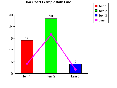
This example uses the same values as the bar chart example in Section 3. It is written for the full version of the component. Use "csDrawGraphTrial.Draw" as the parameter for Server.CreateObject if the trial version is used.
The ShowLinesWithBars property is set to true and AddPoint has been used to add three data points. The X parameter for AddPoint has been set to zero for all three points although any could have been used because it is ignored for this type of graph. The first point is drawn half way along the first bar, the second is drawn half way along the second bar, etc. The maximum number of points that can be drawn for each line is the same as the number of bars. It would be possible to draw another line of three points by calling AddPoint three more times and specifying another colour.
Note that the values of the data points apply to the same y-axis as the bar values. It is not possible to draw a second y-axis with different values.
8. Image Maps
The HTML code required to make an image map to accompany a graph can be generated using csDrawGraph, as described below.
8.1. Image Map Methods
AddMapArea URL, Hint, Extra - This method creates an <area> tag for the image map. URL is the URL for the href attribute, Hint is the string for the title attribute and Extra is a string that will be written into the tag before the closing ">" and it can contain any other attributes such as the target or onMouseOver. Usually AddMapArea will be called once for each data item in the chart.
If an empty string is used for the URL parameter, no href attribute will be used.
SetImageMapParams Name, DataArea, MapLabel, Legend - This method sets some parameters that will be used when generating the image map. If it is not called default values will be used. Name is the image map name and will default to "map1" if not called. DataArea, MapLabel and Legend are all Boolean and are used to determine which map areas are drawn. If DataArea is true an area tag will be written for the pie segment, bar or data point, depending on the graph type. If MapLabel is true an area tag will be written for the text label next to the pie chart or under the bar. If Legend is true an area tag will be written for the coloured square in the legend box, and also for the text in the legend box. All three parameters are true by default so four area tags will be written for each AddMapArea call. The MapLabel and Legend parameters are ignored for line graphs and stacked bar charts because map areas are never created for the labels or legends of these types of graphs.
8.2. Image Map Properties
ImageMapExtra - String. The value of this property will be written into the HTML of the image map between the last automatically generated <area> tag and the closing </map> tag. Set it to include any additional area tags or a default area.
ImageMapText - String, read only. This is the HTML code for the image map. It has no value until the graph has been drawn. Examples of commands which draw a graph are DummyGraph, GIFPie, SaveGIFBar and BMPHandle.
8.3. Generating an Image Map
There is a complication when using csDrawGraph to produce an image map dynamically and it requires a change to the sequence of events. As usual, two scripts are needed to generate and display the graph. One is the "outer" page, which is HTML containing an <img> tag. The other is the "embedded" page, which runs the component, produces the graph and returns binary data to be interpreted as an image by the browser. This is described more fully in the next section entitled "Streaming an Image to the Browser".
The image map must go in the "outer" page because it is HTML code, so the component must be called in this page. There are ways of doing this but each has some disadvantages.
A simple method is to use a session variable to temporarily store the binary image data. Here is an example of two script. First, the outer page calls the component and writes the image to a session variable. The Response.Write statement writes the image map HTML code to the web page.
<%
Set Graph = Server.CreateObject("csDrawGraphTrial.Draw")
Graph.AddData "Data 1", 10, "ff0000"
Graph.AddData "Data 2", 18, "00ff00"
Graph.AddData "Data 3", 7, "0000ff"
Graph.AddMapArea "url1.asp", "Data 1", "target_blank"
Graph.AddMapArea "url2.asp", "Data 2", ""
Graph.AddMapArea "url3.asp", "Data 3", ""
Session("Chart") = Graph.GIFPie
%>
<html>
<title>Test with image map</title>
<body>
<%
Response.Write Graph.ImageMapText
%>
<img src="chart.asp" usemap="#map1" border="0">
</body>
</html>
The embedded script is called "chart.asp" and it streams the session variable to the browser.
<%
Response.Expires = 0
Response.Buffer = true
Response.ContentType = "image/gif"
Response.BinaryWrite Session("Chart")
Session("Chart") = nil
%>
The session variable is set to nil after use to prevent a build up of variables in the memory. Unfortunately, this prevents the browser from being able to print the graph. The alternative is to remove this line and allow the session variables to clear when the session expires. With multiple users this could get demanding on server memory.
Another approach is to save the image to file at the start of the "outer" HTML page and then put this file name inside the <img> tag. This can cause problems if multiple users are trying to read and write the same file. If a unique file name is generated each time some method must be found to delete the image files after use.
A third possibility is to repeat the graph generating code so that it is called in both the outer page and the embedded page. This could be impractical if the code is complex, although perhaps an include file could be used to enable one piece of code to be called from two places. The advantage to this method would be that there would be no session variable to clear from memory, no temporary file to delete, and the graph would be printable from the browser.
The example shown above is for a pie chart with three data items. Note that the calls to AddMapArea are matched with AddData methods in order. If a fourth AddMapArea command was used it would be ignored. The first AddMapArea command uses the Extra parameter to add a target attribute to the <area> tag. The other AddMapArea commands do not use this parameter and so an empty string must be used to maintain correct syntax.
There is no call to SetImageMapParams so the defaults are used. The image map is called "map1" and the hotspots on the image are the pie sectors, the labels, and the legend entries.
Image maps can be produced with line graphs and stacked bar charts but the legend and labels are not used as hot spots. On a line graph, the hot spot is an area around each data point which is double the radius of the plotted point. On a stacked bar chart, each data area within a bar is a hot spot.
Note that the <map> tag will have an id attribute with the same value as the name attribute. The <area> tag will have an alt attribute with the same value as the title attribute. This enables the HTML to validate.
9. Streaming an Image to the Browser
An active server page will return HTML output by default. An HTML page is formatted text which can include spaces to display images. The images themselves are not part of the HTML but are separate files, the location of which is specified inside the <IMG> tag. An ASP page can be an image if the ContentType is set to "image/gif" and the binary data of the image is output using the Response.BinaryWrite command. The ASP image is generated by placing the path to the script inside the <img> tag.
For example, this page will display the image produced by "chart.asp":
<html>
<head><title>HTML page containing an image</title></head>
<body>
<img src="chart.asp">
</body>
</html>
Chart.asp may look like this:
<%@ language=vbscript %>
<%
Response.Expires = 0
Response.Buffer = true
Response.Clear
Set Chart = Server.CreateObject("csDrawGraph.Draw")
Chart.Title = "Example Pie Chart"
Chart.AddData "Item 1", 17, "ff0000"
Chart.AddData "Item 2", 28, "00ff00"
Chart.AddData "Item 3", 5, "0000ff"
Response.ContentType = "image/gif"
Response.BinaryWrite Chart.GIFPie
%>
When the first HTML page is loaded it looks for the image at "chart.asp", runs the script and is sent a stream of binary data in GIF format, so the browser displays the image. It is not possible to place the BinaryWrite command inside the <img> tag to produce the image, it must be in a separate file.
If the line setting the ContentType is missing the image should still display in Internet Explorer but it might not in other browsers. It is important to specify the correct ContentType to maintain compatibility.
It is useful to know that parameters can be passed to the ASP image script using the URL string and this can be read using Request.QueryString and used somewhere in the script.
Example:
<img src="image.asp?type=pie">
9.1. Base64 Encoding of Images
Graph images can be exported as base64 encoded strings. This allows images to be displayed without the need for a separate script called inside an <IMG> tag.
Base64Out (GraphType, FileFormat) - Returns a string which is a base64 encoded image. GraphType specifies the type of graph to be drawn and is in integer in the range 0 to 3 (0 - pie chart, 1 - bar chart, 2 - line graph, 3 - stacked bar chart). FileFormat species the format of the exported image and is an integer in the range 0 to 3 (0 - PNG, 1 - GIF, 2 - BMP, 3 - JPG).
Unlike the other commands for generating graphs, there is only one command for generating base64 output and the parameters determine the type of graph and the image format.
The following code will generate a line graph in PNG format:
<img src="data:image/png;base64, <%= Chart.Base64Out(2, 0) %>" />
This will insert a text string for the image into the image tag. It assumes that a csDrawGraph object called Chart has been created and appropriate data and property values have been set. Note that after the word "base64" there is a comma and a space.
A base64 encoded image is approximately 33% larger than the equivalent binary image, so producing a graph in this way is not necessarily the best method, but it does avoid the need to pass data to an embedded image script.
10. Language Specific Issues
All the examples that are shown with the command descriptions use ASP and VBScript. The csDrawGraph component is a COM object and can be used in most COM enabled environments running on a Windows platform. We cannot begin to cover all the possible development environments here so instead we concentrate on ASP and in this section we show the syntax for Cold Fusion and Visual Basic.
10.1. Active Server Pages
ASP and VBScript is already covered in these instructions but the following points are worth noting.
Calls to methods (functions) do not use brackets, although from IIS 5 their use does not generate an error. For example:
Chart.AddData "Item 1", 17, "ff0000"
These instructions show methods without brackets surrounding the parameters.
Assigning a property value requires an equals sign. Missing the equals sign results in the error "Object doesn't support this property or method". The correct syntax is:
Chart.Title = "Example Pie Chart"
10.1.1. ASP with Javascript
We don't provide any examples of using ASP with other scripting languages, other than VBScript. We will mention the following about using Javascript with ASP.
Brackets are needed around function parameters.
The backslash character is used as an escape character in Javascript and two should be used together when a backslash is needed:
Chart.SaveGIFBar("C:\\output\\barchart.gif");
10.2. Cold Fusion
In Cold Fusion, a COM object is created using the <cfobject> tag:
<cfobject action="create" name="Graph" class="csDrawGraph.Draw">
Each command must be placed inside a <cfset> tag and all method parameters must be enclosed by brackets:
<cfset Graph.AddData("Item 1", 17, "ff0000")>
<cfset Graph.AddData("Item 2", 28, "00ff00")>
<cfset Graph.AddData("Item 3", 5, "0000ff")>
<cfset Graph.SaveGIFBar("c:\output\bar.gif")>
Alternatively, the commands can be put inside a <cfscript> block:
<cfscript>
Graph.AddData("Item 1", 17, "ff0000");
Graph.AddData("Item 2", 28, "00ff00");
Graph.AddData("Item 3", 5, "0000ff");
Graph.SaveGIFBar("c:\output\bar.gif");
</cfscript>
Cold Fusion version 5 does not support variant arrays and so commands such as GIFPie, GIFBar and GIFLine commands cannot be used. Without these commands, images cannot be streamed directly to the browser so any dynamically produced image must be saved to a temporary file first and then displayed using a <cfcontent> tag.
It is possible to stream images using Cold Fusion without saving to a temporary file first. The following commands will stream an image assuming a bar chart has been drawn in a csDrawGraph object called "Graph".
<cfscript>
Context = GetPageContext();
Context.SetFlushOutput(false);
Response = Context.GetResponse().GetResponse();
Out = Response.GetOutputStream();
Response.SetContentType("image/gif");
Out.Write(Graph.GIFPie);
Out.Flush();
Response.Reset();
Out.Close();
</cfscript>
For more on using csDrawGraph with Cold Fusion visit www.chestysoft.com/drawgraph/cf.htm.
Initially, 64 bit versions of Cold Fusion had no support for COM objects. COM support was added with Cold Fusion 10 Update 11.
10.3. Visual Basic
For best results import the csDrawGraph type library into VB by selecting "Project" from the menu bar, then "References". The dialogue box will then show available type libraries. Scroll down to "csDrawGraph Library", check the box and click OK. This will add the "Draw" class from csDrawGraph to the Object Browser, making it available for early binding.
To create an instance of the object called "Graph" use the following code:
Dim Graph As Draw
Set Graph = CreateObject("csDrawGraph.Draw")
Displaying an image from csDrawGraph in a VB picture box is not simple as it involves an API call to create a bitmap. There is a description of this and some sample code on our web site at: www.chestysoft.com/drawgraph/vbgraph.asp
Visual Basic 5 or 6 is a 32 bit application and so the 32 bit version of csDrawGraph must be used.
We have an OCX control called csXGraph which is more suited for use with Visual Basic: www.chestysoft.com/xgraph/default.asp
10.4. ASP.NET
csDrawGraph can be used with ASP.NET. The component must be registered on the server as described earlier and it can be called using Server.CreateObject. For example:
Dim Chart = Server.CreateObject("csDrawGraph.Draw")
The object is created using Dim instead of Set. For the trial version the class name is "csDrawGraphTrial.Draw".
The image cannot be streamed to the browser in a single line because of incompatibilities between ActiveX and .NET, but there is a workaround which we describe in the VB.NET example below.
<%@ Page language="vb" debug="true" %>
<%
Response.Expires = 0
Response.Buffer = true
Response.Clear
Dim Chart = Server.CreateObject("csDrawGraph.Draw")
Chart.AddData("Item 1", 17, "ff0000")
Chart.AddData("Item 2", 28, "00ff00")
Chart.AddData("Item 3", 5, "0000ff")
Dim OutArray As Array = Chart.GIFBar
Dim ByteArray(OutArray.Length - 1) As Byte
Array.Copy(OutArray, ByteArray, OutArray.Length)
Response.ContentType = "Image/gif"
Response.BinaryWrite(ByteArray)
%>
The last block of code produces the bar chart as a GIF and streams it to the browser. The output from the GIFBar property is read into OutArray which is then copied into an array of bytes called ByteArray. This array of bytes can be used in the Response.BinaryWrite command. In old ASP the BinaryWrite command could take the value of GIFBar directly.
In VB.NET brackets are used to enclose function parameters.
10.4.1. Early Binding
The previous example used late binding, which is the easier way of calling an ASP component in ASP.NET. It is more efficient to use early binding, but this requires the creation of a .NET Framework Interop Assembly using the TLBIMP tool, supplied with the Framework. This assembly is a DLL which acts as a wrapper for the ASP component.
After registering the component, run TLBIMP.exe from the command prompt or from the Run box in the Start Menu. The syntax is:
TLBIMP ComponentName.dll /out:NewName.dll
Full paths are required for both DLLs. The new DLL needs to be put in the website's BIN directory. The script that calls the component must import the Interop Assembly as a NameSpace. The component instance is created using the following VB.NET syntax:
Dim ObjName As New ClassNameClass()
ObjName is the name of the object instance and ClassName is the name of the class in the ASP component, which is Draw in csDrawGraph.
The script that uses the component must import the Interop Assembly as a Namespace. If the Interop Assembly is called "csdrawgraphnet.dll" the following line imports it:
<%@ Import Namespace = "csdrawgraphnet" %>
In the previous example the only other change required is to replace the Server.CreateObject line with:
Dim Chart As New DrawClass()
11. Revision History
The current version of csDrawGraph is 3.1
New in Version 2.1
Negative values allowed on bar charts and line graphs.
Some extra formatting options including Prefix, Suffix and comma separators on large values.
Separate property added for the plot area colour. (This could cause some incompatibility with earlier versions where the
whole background colour was set using BGColor.)
The graduation marks on the axes can be changed in size or removed.
Extra text can be added at specified coordinates.
ShowLine property added to allow drawing of scatter diagrams.
New in Version 2.2
Image maps.
Text can be added to line graphs using data coordinates.
ShowPlotBorder property added.
HideHGrid and HideVGrid added.
New in Version 2.3
Unicode character support added.
Compressed GIFs now supported.
OLEColorToStr function added.
Improvements to line graph text.
New in Version 2.4
Stacked bar charts.
Image maps can be made for line graphs.
New in Version 2.5
AddExtraLine.
LegendAlign and LegendVertical.
DateFormatString and TimeFormatString.
Separate X and Y versions of Prefix, Suffix and ShowSeparator for line graphs.
AddText now has its own font properties, TextFont etc. Previous versions used the AxisText properties.
New in Version 2.6
Trend lines in bar charts.
The DummyGraph function and related properties.
New in Version 2.7
Optional plotted points and lines in bar charts.
New in Version 3.0
64 bit version released.
New in Version 3.1
Base64Out for output of images using base64 encoding.
12. Sample Graphs
A selection of graphs are shown on our demonstration web site to show how different property settings affect the appearance - https://demo.chestysoft.com/demos.asp. There is also a downloadable example using a MS Access database as well as a pie chart with an image map.
Bar Charts - https://demo.chestysoft.com/drawgraph/barcharts.asp
Pie Charts - https://demo.chestysoft.com/drawgraph/piecharts.asp
Line Graphs - https://demo.chestysoft.com/drawgraph/linegraphs.asp
Stacked Bar Charts - https://demo.chestysoft.com/drawgraph/stackedbarcharts.asp
Database Example - https://demo.chestysoft.com/drawgraph/databasedemo.asp
Image Map - https://demo.chestysoft.com/drawgraph/imagemap.asp
There are also some Cold Fusion examples - https://demo.chestysoft.com/cfdemos.cfm
13. Other Products From Chestysoft
ActiveX Controls
csXImage - An ActiveX control to display, edit and scan images.
csXGraph - An ActiveX control to draw pie charts, bar charts and line graphs.
ASP Components
csImageFile - Resize and edit JPG, BMP, GIF, PNG, PCX, PSD, TIF and WBMP images.
csImageLite - A cut-down version of csImageFile for resizing and merging images.
csASPUpload - Process file uploads through a browser.
csASPGif - Create and edit animated GIFs.
csASPZipFile - Create zip files and control binary file downloads.
csFileDownload - Control file downloads with an ASP script.
csFTPQuick - ASP component to transfer files using FTP.
Web Hosting
We can offer ASP enabled web hosting with our components installed. Click for more details.
14. Alphabetical List of Commands
Click on one of the links below to go directly to information about that command:
- AddCustomLegend
- AddData (Bar Charts)
- AddData (Pie Charts)
- AddExtraLine
- AddGroupedData
- AddLineGraphText
- AddMapArea
- AddMarker
- AddPoint
- AddText
- AddXValue
- AddYValue
- AxisTextBGColor
- AxisTextBold
- AxisTextColor
- AxisTextFont
- AxisTextSize
- BarGap
- BarTotalVertical
- BarWidth
- Base64Out
- BGColor
- BMPBar
- BMPHandle
- BMPLine
- BMPPie
- BMPStackedBar
- CenterX
- CenterY
- ClearCustomLegend
- ClearData
- CustomLegend
- DataCount
- DateFormatString
- DateTimeFormat
- Decimals
- DummyGraph
- FirstBarPos
- GIFBar
- GIFLine
- GIFPie
- GIFStackedBar
- GraphPen
- GridColor
- GridStyle
- Height
- HideHGrid
- HideVGrid
- ImageMapExtra
- ImageMapText
- JpegQuality
- JPGBar
- JPGLine
- JPGPie
- JPGStackedBar
- LabelBGColor
- LabelBold
- LabelColor
- LabelFont
- LabelSize
- LabelVertical
- LastBarPos
- LegendAlign
- LegendBGColor
- LegendColor
- LegendFont
- LegendInvert
- LegendHideEmptyNames
- LegendTextSize
- LegendVertical
- LegendX
- LegendY
- LineGraphBorderColor
- LineGraphLeaderColor
- LineGraphTextAlign
- LineGraphTextBGColor
- LineGraphTextBold
- LineGraphTextBorder
- LineGraphTextColor
- LineGraphTextFont
- LineGraphTextLeader
- LineGraphTextSize
- LineGraphTextX
- LineGraphTextY
- LineWidth
- MaxX
- MaxY
- Offset
- OLEColorToStr
- OriginX
- OriginY
- Padding
- PieDia
- PlotAreaColor
- PNGBar
- PNGLine
- PNGPie
- PNGStackedBar
- PointSize
- PointStyle
- Prefix
- PrefixX
- PrefixY
- ReadBarGap
- ReadBarWidth
- ReadXGrad
- ReadXTop
- ReadYGrad
- ReadYTop
- RNDColor
- SaveBMPBar
- SaveBMPLine
- SaveBMPPie
- SaveBMPStackedBar
- SaveGIFBar
- SaveGIFLine
- SaveGIFPie
- SaveGIFStackedBar
- SaveJPGBar
- SaveJPGLine
- SaveJPGPie
- SaveJPGStackedBar
- SavePNGBar
- SavePNGLine
- SavePNGPie
- SavePNGStackedBar
- SetImageMapParams
- ShowBarTotal
- ShowGrid
- ShowLabel
- ShowLegend
- ShowLegendBox
- ShowLine
- ShowLinesWithBars
- ShowNumbers
- ShowPercent
- ShowPlotBorder
- ShowSeparator
- ShowSeparatorX
- ShowSeparatorY
- ShowStackedValue
- ShowTotalifZero
- ShowTrendLine
- Square
- StackedTextAlign
- StackedTextBGColor
- StackedTextColor
- StackedTextFont
- StackedTextSize
- StackedTextTransparent
- StartAngle
- Suffix
- SuffixX
- SuffixY
- TextBGColor
- TextBold
- TextColor
- TextFont
- TextItalic
- TextSize
- TextTransparent
- TextUnderline
- TimeFormatString
- Title
- TitleBGColor
- TitleBold
- TitleColor
- TitleFont
- TitleSize
- TitleTextAlign
- TitleX
- TitleY
- TransColor
- Transparent
- TrendLineColor
- TrendLineName
- TrendLineWidth
- UseXAxisDates
- UseXAxisLabels
- UseYAxisDates
- UseYAxisLabels
- Version
- VerticalBars
- Width
- XAxisNegative
- XAxisText
- XGrad
- XMarkSize
- XOffset
- XTop
- XPixelsPerUnit
- XValuesVertical
- YAxisNegative
- YAxisText
- YGrad
- YMarkSize
- YOffset
- YPixelsPerUnit
- YTop